whatsapp


WELCOME TO ECO HOUSE !WELCOME TO ECO HOUSE !WELCOME TO ECO HOUSE !


News
30/10/25
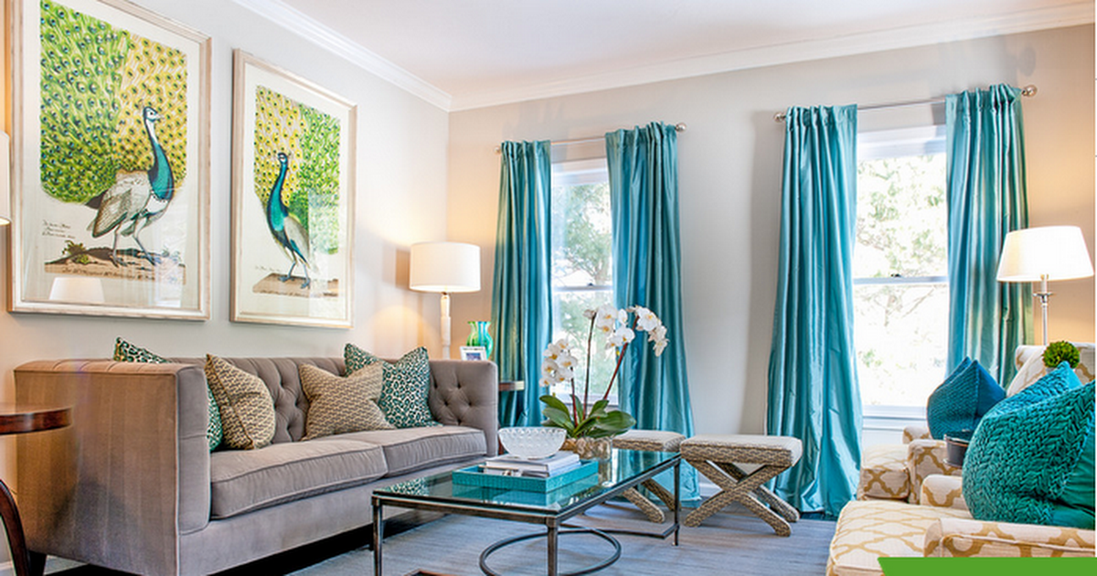
Rules for Choosing Window Decor Color
Choosing the right color for window treatments is the key to a harmonious interior. Let's look at the basic principles that will help you avoid mistakes and create an aesthetically pleasing space.
1. Consider the interior style
• Classic: pastel tones (beige, pearl, pale blue), textured fabrics (jacquard, velvet).
• Minimalism/Scandinavian: white, gray, muted green – simple forms without excessive decoration.
• Loft/High-Tech: anthracite, graphite, metallic gray – clean lines, roller blinds or blinds.
• Provence/Country: lavender, mint, sand – lightweight fabrics with floral prints.
2. Consider the lighting
• North-facing windows (low light): warm, light shades (cream, peach) will visually "warm" the space. • South-facing windows (too much light): cool tones (gray, blue, lilac) or thick fabrics (blackout) for darkening.
3. Maintain a balance with decoration and furniture.
• Monochromatic interior: decor 1-2 shades darker or lighter than the walls.
• Contrasting accents: bright textiles (emerald, terracotta) with a neutral base.
• Repeating colors: the shade of the curtains should echo the interior elements (pillows, rugs, furniture upholstery).
4. Adjust the proportions of the room.
• Small windows: light fabrics with vertical stripes will visually enlarge the opening.
• Panoramic windows: neutral tones (gray, beige) or translucent tulle will not overwhelm the space.
• Low ceilings: curtains that match the walls will create a unified effect. 5. Choose a shade based on color psychology
• Blue/light blue: calming, suitable for bedrooms and studies.
• Green: harmonizing, ideal for living rooms and children's rooms.
• Yellow/orange: energizing, good for kitchens and work areas.
• Pink/lavender: adds a romantic touch, suitable for bedrooms and girls' rooms.
• Gray/beige: neutral, versatile for any room.
6. Test the color in real-life conditions
• Place test samples against a window in daylight and evening light.
• Keep in mind that glossy fabrics (satin, satin) enhance brightness, while matte fabrics (linen, cotton) soften the shade.
7. Combine textures
• Light tulle + heavy curtains – layering adds depth. • Smooth fabric + woven valance – the contrast of textures enlivens the decor.
8. Consider functionality
• For the bedroom: blackout or thick cotton – provide darkening.
• For the kitchen: easy-to-wash materials (polyester, satin) in neutral or bright colors.
• For the children's room: hypoallergenic fabrics (cotton, bamboo) in cheerful shades.
9. Avoid common mistakes
• Sharp contrasts with a PVC frame (for example, bright red on a white frame without support in the interior).
• Pattern overload – if the wallpaper or furniture has a print, choose solid-color textiles.
• Inconsistency in scale: a large pattern on curtains in a small room “eats up” space.
10. Trust your intuition
Even when following the rules, be guided by personal preferences. The decor should be pleasing to the eye and create a comfortable atmosphere.
What windows do you like the best?
Which kind of windows would you prefer If you were going to replace the old ones in your house or apartment?
Eco House Joint Stock Company partner of Deceuninck Group | Copyright 2009-2026. All rights reserved.
E-mail: info@ecohouse-eg.com, tel.: +201212288828
Site www.ecohouse-eg.com is for informational purposes only and under no circumstances is not a public offer. For more information on the cost of materials, products and services, please contact the sales offices